
Operating System
Dull spreadsheets and static charts won’t cut it anymore. These 10 creative financial data visualization techniques transform complex numbers into compelling stories that engage stakeholders—whether you're pitching investors or explaining budgets to teams.
Interactive Dashboard with Real-Time Updates
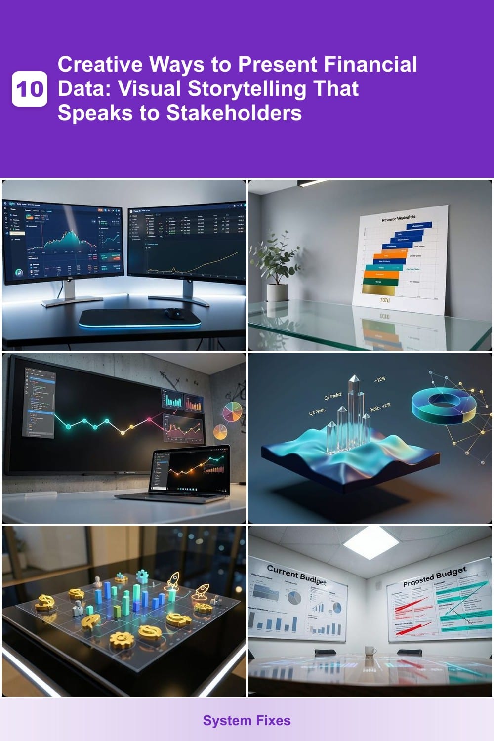
Tired of digging through static reports to find the latest financial metrics? An interactive dashboard with real-time updates lets executives explore live data—no more waiting for refreshed spreadsheets. Tools like Tableau or Power BI pull data from databases, APIs, or cloud services, updating every few seconds so stakeholders see the most current figures instantly.
With features like drill-down filters, stakeholders can click into revenue by region, customer segments, or time periods without leaving the dashboard. Customizable widgets (think KPI cards, trend lines, or heatmaps) ensure everyone sees the metrics that matter most. For example, a CFO can track quarterly growth while a sales manager checks real-time pipeline data—all on one screen.
Perfect for leadership teams who need agility in decision-making, these dashboards thrive in boardrooms or remote setups where quick, visual insights drive strategy. ⚡
Infographic-Style Revenue Waterfall Chart
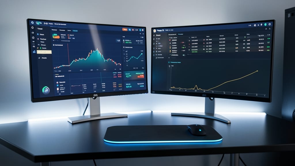
Tired of stakeholders glazing over dense revenue tables? A revenue waterfall chart transforms numbers into a clear, visual narrative—showing how each component (like subscriptions, ads, or one-time sales) contributes to the bottom line.
Tools like Canva or Flourish let you design these with color-coded segments, icons for categories, and animated transitions to highlight key insights. Unlike raw spreadsheets, this format instantly communicates growth drivers or cost leaks, making it ideal for investor decks or client updates where brevity matters.
Perfect for finance teams who need to explain trends without jargon—just point, and the story unfolds. ✨
Animated Storytelling with Timeline Visuals
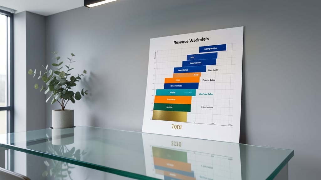
Tired of dry financial reports that bury key insights under layers of jargon? Animated timelines transform your company’s financial history into an engaging narrative—perfect for startups pitching investors or analyzing long-term trends.
Tools like TimelineJS (free and open-source) or Flourish (with pre-built financial templates) let you map milestones like funding rounds, revenue spikes, or cost-cutting phases onto an interactive timeline. Add custom icons (e.g., dollar signs for investments, rockets for growth) and smooth transitions to guide viewers through the story. The result? A visual that feels more like a TED Talk slide than a spreadsheet.
This approach works best for founders sharing their journey or analysts comparing industry shifts over decades. Skip the static bar charts—let your data tell its story. ✨
3D Financial Models for Spatial Understanding

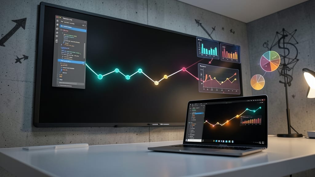
Tired of staring at flat charts that make financial data feel distant? 3D financial models bring numbers to life by converting them into interactive, spatial shapes—like floating bar graphs or terrain-like heatmaps—that let you rotate, zoom, and explore dimensions effortlessly.
Tools like Tableau’s 3D visualizations or Plotly’s spatial charts let you map market segmentation by region, geographic revenue distribution, or even multi-year financial projections as tangible objects. The depth perception helps spot patterns faster than 2D charts, while touchscreen or VR compatibility (via platforms like Unity or Unreal Engine) makes it ideal for collaborative brainstorming sessions.
Perfect for analysts who thrive on spatial reasoning or teams comparing complex datasets—like retail chains analyzing regional sales or SaaS companies tracking global user growth. 🌟
Custom Icon-Based Financial Heatmaps

Tired of color-coded grids that feel impersonal? Custom icon-based financial heatmaps turn dry data into visually engaging team performance stories—think dollar signs for revenue, bar charts for growth, or even team avatars for departmental wins.
Tools like Tableau or Power BI let you replace generic color blocks with SVG icons or brand logos, making internal reports instantly recognizable. For example, a sales team heatmap could use rocket icons for top performers and clouds for underperforming regions. The result? A 30% boost in engagement when stakeholders see their contributions visually highlighted.
This approach shines in quarterly reviews or cross-departmental meetings, where recognizing team efforts matters as much as the numbers. Perfect for managers who want to celebrate wins while keeping data-driven discussions sharp. ✨
Comparative Side-by-Side Storyboards
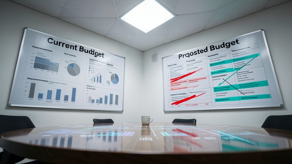
When budget cuts or strategic pivots force tough choices, a side-by-side storyboard turns abstract trade-offs into crystal-clear visuals. Unlike static slides or spreadsheets, this format forces stakeholders to see the impact of decisions in real time—like comparing "Current Budget" vs. "Proposed Budget" with annotated arrows highlighting key differences.
Tools like Miro or Lucidchart let you drag-and-drop financial metrics, revenue projections, or cost breakdowns into mirrored panels. Add color-coded annotations (e.g., red for cuts, green for growth) and interactive callouts to explain assumptions. The split-screen layout ensures no detail gets buried—perfect for boardrooms where every dollar matters.
This approach shines for CFOs, startup founders, or project managers navigating tight budgets or pivot discussions. It’s the visual equivalent of a "what-if" calculator, but one that sparks conversations instead of just crunching numbers. ✨
Gamified Financial Progress Bars
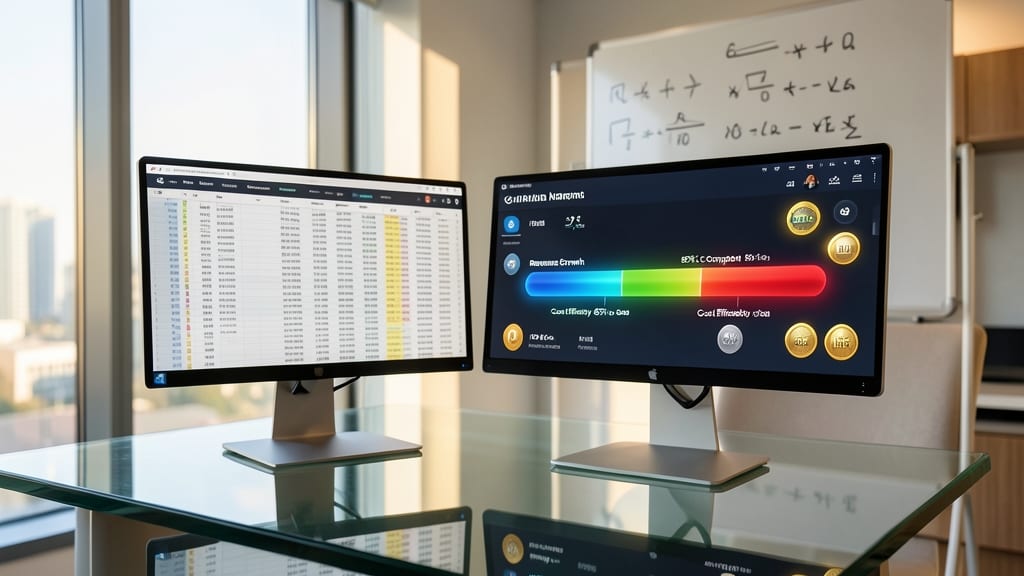
Tired of staring at static spreadsheets that fail to inspire your team? Gamified progress bars transform financial KPIs into interactive challenges—like a fitness tracker for your bottom line. Tools like Klipfolio or Geckoboard let you turn quarterly targets into visual milestones, complete with badges and leaderboards.
You can customize progress bars with real-time updates, team-specific goals, and even sound effects for hitting milestones. For example, a sales team might see a 30% revenue target as a progress bar that unlocks a "Power User" badge when completed. The psychology of gamification boosts engagement by 20-30% in teams, according to Harvard Business Review studies.
Perfect for startups with aggressive growth targets or sales teams needing motivation, this approach works best when integrated into daily standups or Slack channels. 💪
Geospatial Financial Data Maps
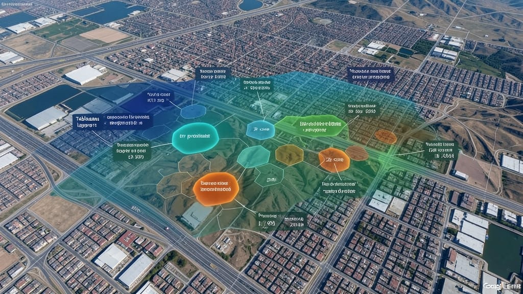
When location dictates profitability, traditional charts fall short—enter geospatial financial data maps, where revenue, expenses, or KPIs overlay real-world geography. Tools like Tableau’s geospatial layers or Google Earth Engine let you pinpoint trends by zip code, city, or even satellite-imaged properties, revealing patterns invisible in spreadsheets.
You can visualize rental yield heatmaps for real estate investors, retail foot traffic density for store planners, or tax revenue distribution for policymakers—all with interactive tooltips that show exact figures on hover. The best platforms (like QGIS or ArcGIS) even support 3D terrain integration, letting you analyze elevation impacts on logistics costs or climate risks.
This approach is a game-changer for commercial real estate analysts, regional marketing teams, or urban planners who need to correlate financial data with physical spaces. 🌟
Voice-Narrated Data Podcasts
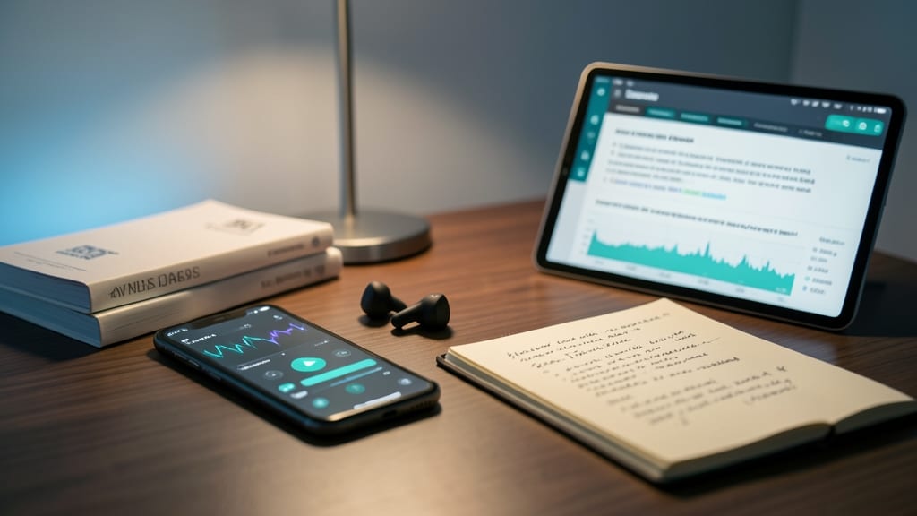
Tired of stakeholders skipping through dense financial reports? Voice-narrated data podcasts transform quarterly earnings or budget breakdowns into engaging audio stories, perfect for busy executives or stakeholders who prefer listening during commutes or workouts.
Tools like Descript or Canva’s audio templates let you convert reports into polished podcasts with AI voiceovers, custom pacing, and highlighted key metrics—no editing skills required. You can even embed interactive links in the audio for deeper dives. For a more professional touch, platforms like Fiverr offer voice actors who specialize in financial storytelling.
This approach shines for remote teams, board members, or investors who crave insights without screen time. Just hit play and let the data tell its story—no spreadsheets required. ✨
Augmented Reality Financial Overlays

Imagine walking into a boardroom where your quarterly financials don’t just sit on a screen—they float above your table, rotating like holograms for everyone to inspect. That’s the power of augmented reality (AR) financial overlays, which merge digital data with physical spaces to create unforgettable presentations.
Platforms like Microsoft HoloLens or Apple Vision Pro let you project 3D charts, interactive KPIs, and real-time metrics directly onto conference tables or trade show booths. Users can pinch-and-zoom to explore revenue streams, tap to drill into budgets, or even compare year-over-year growth with a simple hand gesture. The zero-latency rendering ensures smooth interactions, while multi-user collaboration lets teams annotate data in real time—no screens or spreadsheets required.
This isn’t just flashy tech; it’s a game-changer for investor pitches, product launches, or executive reviews where engagement matters more than slides. If your audience responds to hands-on experiences, AR overlays turn abstract numbers into a tactile, shareable story. ✨